
How to Create a High Converting Landing Page That Turns Visitors Into Customers
A practical guide to creating landing pages that match user intent, communicate value clearly, build trust, and encourage visitors to take action.
Introduction
A landing page can receive hundreds or thousands of visitors and still generate very few leads. The problem is often not traffic. It is what happens after the visitor arrives.
A high converting landing page gives visitors a clear reason to stay, explains the value of the offer, removes unnecessary confusion, builds trust, and makes the next step obvious.
This becomes especially important when you are running Google Ads, Meta Ads, email campaigns, social media promotions, or lead generation campaigns. Sending visitors to a general homepage can make it difficult for them to understand what they should do next.
A focused landing page creates a more direct path.
For example, a dental clinic promoting dental implant consultations could send advertising traffic to a dedicated page explaining the treatment, answering common questions, displaying relevant trust information, and providing a simple appointment form.
The source material emphasizes that landing page activity should begin with a clear goal, audience understanding, useful content, a logical customer journey, and meaningful measurement.
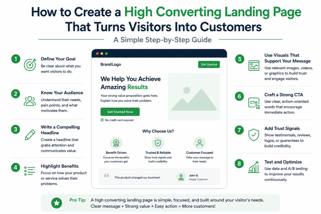
Table of Contents
What Is a Landing Page?
A landing page is a dedicated webpage designed around a specific marketing objective.
That objective could be:
- Generate leads
- Book appointments
- Sell a product
- Register users
- Download a resource
- Request a quote
- Schedule a consultation
Unlike a general website page, a landing page usually focuses on one primary action.
For example, a digital marketing agency running an advertisement for SEO services could create a dedicated page specifically for SEO consultations rather than sending visitors to the homepage.
The visitor sees one relevant message and one clear next step.
What Makes a Landing Page High Converting?
A high converting landing page does not depend on one design trick.
It is the result of several elements working together.
| Element | Purpose |
|---|---|
| Headline | Communicates the main promise |
| Value proposition | Explains why the offer matters |
| Supporting copy | Answers important questions |
| Visuals | Helps visitors understand the offer |
| Trust signals | Reduces uncertainty |
| Call to action | Tells visitors what to do |
| Form | Captures the required information |
| Page structure | Guides the visitor naturally |
| Measurement | Shows what needs improvement |
The important point is relevance.
A perfectly designed landing page can still perform poorly if the message does not match the reason the visitor arrived.
How to Create a High Converting Landing Page
1. Start With One Clear Goal
Before designing anything, decide what you want the visitor to do.
Do you want them to:
- Book a call?
- Fill out a form?
- Buy something?
- Download a guide?
- Request a quote?
Do not give the visitor five competing primary actions.
A clear objective makes the rest of the page easier to build.
The source material recommends defining success before choosing tactics and ensuring each activity has a reason for existing.
2. Understand Your Audience
Before writing landing page copy, understand the person who will read it.
Identify:
- Their problem
- Their motivation
- Their concerns
- Their objections
- Their desired outcome
- What information they need before taking action
Customer conversations, reviews, comments, search queries, and sales questions can reveal useful patterns.
For example, a real estate landing page for first time home buyers should answer different questions from a page targeting property investors.
The audience determines the message.
Write a Clear Headline
The headline is often the first thing a visitor notices.
It should quickly communicate what the page is about and why the visitor should care.
Avoid vague statements such as:
“Take Your Business to the Next Level”
Instead, make the benefit more specific.
For example:
“Get a Practical SEO Strategy for Your Small Business”
A good headline reduces uncertainty.
The visitor should not have to spend several seconds figuring out what you are offering.
Create a Strong Value Proposition
Your value proposition explains the practical benefit of choosing your offer.
Ask:
What problem does this solve?
Who is it for?
What makes this offer useful?
Why should the visitor consider it?
A strong value proposition does not need complicated language.
For example, a dental clinic could say:
“Get a personalized dental implant consultation with clear treatment guidance from our clinical team.”
The statement explains the service and gives the visitor a reason to continue.
Use a Clear Call to Action
The call to action tells the visitor what to do next.
Examples include:
- Book a Consultation
- Request a Quote
- Get Started
- Schedule an Appointment
- Download the Guide
- Request a Demo
The CTA should be easy to find and consistent with the page objective.
A confusing CTA creates friction.
For example, if the headline promises a free consultation, the CTA should not suddenly say “Learn More” without explaining what happens next.
Keep Forms Simple
Forms are often where conversions are lost.
Ask only for information you genuinely need.
For a consultation request, you may need:
- Name
- Phone number
- Service required
You may not need ten additional fields.
There is no universal ideal form length. The right number of fields depends on the offer, customer intent, and business requirements.
The goal is to reduce unnecessary effort without collecting information you need later.
Add Trust Signals
Visitors may hesitate because they are uncertain.
Trust signals can help reduce that uncertainty.
Depending on the business, these might include:
- Customer testimonials
- Reviews
- Case studies
- Client logos
- Professional credentials
- Guarantees where appropriate
- Security information
- Transparent pricing
- Contact information
- Relevant experience
For a dental clinic, professional qualifications and genuine patient reviews may matter.
For a digital marketing agency, case studies and measurable outcomes can provide useful evidence.
Trust should be supported by real information rather than exaggerated claims.
Match the Landing Page With the Campaign
One of the most important principles in landing page optimization is message consistency.
Suppose a Google advertisement says:
“SEO Services for Small Businesses”
The landing page should immediately continue that conversation.
If the visitor instead reaches a generic homepage with ten unrelated services, they may wonder whether they clicked the wrong advertisement.
A campaign and its landing page should feel connected.
This supports the broader customer journey principle described in the source material, where the experience should remain connected from the first interaction through the next action.
Optimize the User Experience
A good landing page should be easy to understand and use.
Pay attention to:
- Mobile responsiveness
- Loading speed
- Readable text
- Visual hierarchy
- Button visibility
- Navigation
- Form usability
- Content spacing
Remove anything that distracts from the main action.
This does not mean creating an empty page with almost no information.
Instead, provide enough information to answer the visitor’s important questions while maintaining a clear path toward the intended action.
Measure and Improve Performance
A landing page is not finished when it is published.
Measure what happens.
Depending on your goal, useful metrics may include:
| Objective | Useful Metric |
| Lead generation | Qualified leads |
| Sales | Purchases and revenue |
| Consultation | Completed bookings |
| Form completion | Conversion rate |
| Advertising | Cost per acquisition |
| Engagement | Relevant page activity |
The source material recommends connecting measurement to the original goal and using results to decide what to improve, stop, test, or scale.
This is where A/B testing can become useful.
You might test:
- Headline
- CTA wording
- Form length
- Page structure
- Supporting message
- Visual elements
Change one important variable at a time when you want to understand its impact.
Common Mistakes
Using a Generic Homepage
A campaign specific visitor should ideally arrive on a relevant page.
Too Much Information
Do not bury the main message under unnecessary paragraphs.
Too Little Information
Visitors may leave if important questions remain unanswered.
Weak CTA
Make the next action clear.
Too Many Actions
Multiple competing actions can distract visitors.
Ignoring Mobile Visitors
A page that looks good on desktop can still be difficult to use on a phone.
Measuring Only Traffic
Traffic does not automatically mean business value. The source material notes that traffic alone does not show whether the audience is valuable.
Practical Example
Imagine Native Linkage is running an advertising campaign for SEO services for small businesses.
Instead of sending traffic to the homepage, the campaign leads to a dedicated landing page.
The page could contain:
Headline: SEO Strategy Built Around Your Business Goals
Supporting message: Understand your search opportunities, improve your website visibility, and create a practical content plan.
Trust: Client results, testimonials, relevant experience
CTA: Book a Free Consultation
Form: Name, email, phone number, business website
The entire page supports one purpose.
That makes the visitor’s next step much easier to understand.
Frequently Asked Questions
A high converting landing page is a focused webpage designed to encourage visitors to complete a specific action such as submitting a form, booking a consultation, making a purchase, or requesting information.
Clear messaging, strong relevance, a useful value proposition, trust signals, an obvious CTA, simple forms, good user experience, and continuous measurement can all contribute to better conversion performance.
There is no fixed number. However, the page should have one clear primary action, even if that action appears more than once.
It depends on the campaign and objective. Removing unnecessary distractions can sometimes help maintain focus, but navigation may still be useful when visitors need additional information before making a decision.
Yes. A relevant landing page can provide a more focused experience after someone clicks an advertisement and can help connect the campaign message with the desired business action.
Conclusion
Creating a high converting landing page is less about copying a particular design and more about understanding the visitor.
Start with a clear business goal. Understand the audience. Match the page to the campaign. Explain the value clearly. Build trust. Make the CTA obvious. Keep the form practical. Remove unnecessary friction. Then measure what happens.
The strongest landing pages are not necessarily the most visually complicated.
They are the ones that make the visitor think:
“This is exactly what I was looking for, and I know what to do next.”
That clarity is the foundation of effective conversion focused marketing.